Outside-the-Bottle Thinking
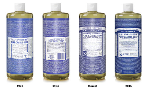
Dr. Bronner's recently redesigned their famously dense label. Here's how it came to be, and where modern bottle design stands.
3,121

Dr. Bronner's and the art of the retro-tinged redesign
The design of a Dr. Bronner's bottle is not meant to be criticized. It was originally produced by a man who launched a popular line of soap after escaping from a Chicagoland mental institution and coming up with his own religion of peace. It is beyond criticism.
With the amount of text that has to show up on each bottle, there is no room for criticism. It is best left off to the side, in your pocket, along with the rest of your stupid comments.
Like The Drudge Report, it's all in on the general design at this point. But sometimes, even beautiful skin needs a wash-up. Back in March, Dr. Bronner's announced that it was releasing "Old & Improved" labeling across each of its product lines. Gone was the Times New Roman font that had long been the largest type on the page, as well as the Helvetica that showed up everywhere else. In its place was "DR. BRONNER'S" in Futura display type along with well-considered agate type that is a lot easier to read than the old one. (Per my type-reading eyes, the font used on most of the bottle looks like a variant of News Gothic.)
As shown in the image above, it's actually a regression of sorts, but one with the handiwork of a typographer.
“For this current refresh of our labels,” Dr. Bronner's Vice President Michael Bronner explains, “we have gone to our past to define our future. With a label as densely-worded as our own, we have now given proper balance to all the information and improved the readability of our grandfather’s message for optimal bathroom reading.”
This, friends, is a perfect example of great design. It changed something that didn't need to be changed at all, but did it in a way that gave the intent of the original product the subtle respect it deserves. Dr. Bronner would be proud.
"You couldn't talk to him on a human level. It was just these tirades. 'Why are we not talking about uniting Spaceship Earth? What's more important?' My dad was much more down to earth. He didn't care about all the cosmic stuff. As soon as my grandfather would start talking about it, he'd be like, 'I don't want to hear that crap!'"
— David Bronner, the hippieish grandson of Dr. Emanuel Bronner, discussing what it was like growing up with a grandfather famous for making soap that became popular with hippies. At first, the younger Bronner had his eye on moving to Amsterdam and growing pot, but eventually he found himself drawn back to the company, which he saw as a potential vessel for social change. Since taking over, he's used his company's reach to help push for various political issues, most notably the fight against GMO labeling in Washington state back in 2013.

The science behind getting a little bit more out of your jars of mayo
For every bottle of sriracha, ranch dressing, and mustard you buy, you know you're throwing away at least five percent of it. That doesn't sound like very much, but all that squeezing adds up into a lot of extra purchases, a lot of waste, and a little more junk at the bottom of the landfill.
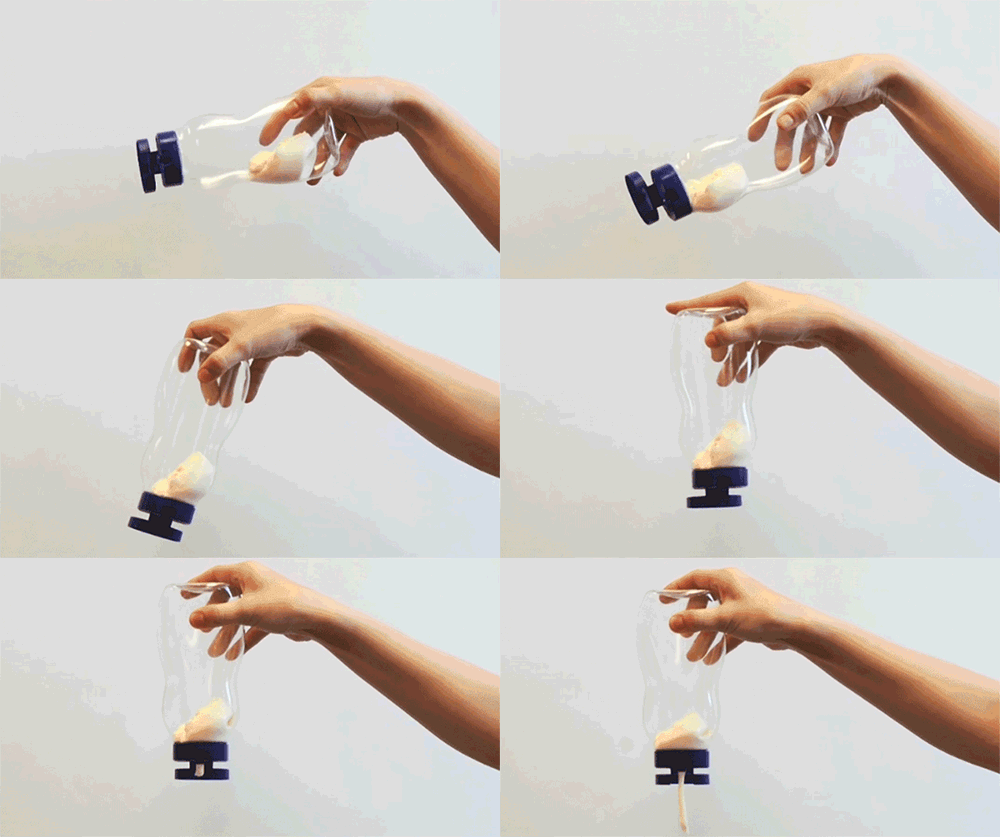
Fortunately, someone has already been working on this crisis. The MIT researchers behind LiquiGlide, a company that's creating technology to coat the innards of bottles with just enough slickness that every drop is easy to reach, have already signed contracts with Elmer's Glue and Orkla, a European company that hopes to use the tech to sell mayonnaise.
The secret, notes Wired, is that it doesn't create a surface that's perfectly slick for every substance. Rather, it creates one that perfectly matches the chemical structure of the substance that's usually in the bottle—and, oh yeah, meets FDA approval for safety.
"When the solid matches the liquid just right, capillary forces create a permanently wet, highly stable coating that the product inside a bottle flows right over," the magazine's Katie M. Palmer explains.
57
The guy who ensured every Coke bottle looked exactly the same
The city of Toledo often gets forgotten in the context of its larger Ohio brothers Cincinnati, Cleveland, and Columbus, but the city is responsible for taking a job that was once the product of the human hand and replacing it with a machine.
Michael J. Owens, a superintendent at the Libbey glass factory in the city, played a key role in ensuring that light bulbs kept rolling off the production line in the midst of a strike at New York's Corning plant. But it was what he did after helping solve this crisis that ensured his place in history.
Owens figured out a way to automate some of the processes of making light bulbs, and after succeeding at that task, he went a step further, working to develop a machine that could automatically produce bottles without the help of a human hand. With the support of his boss, Edward Drummond Libbey, Owens eventually designed a machine that could make glass bottles in uniform shapes and sizes.
Despite building a machine that helped make millions of lives easier, he never got the plaudits of more famous inventors like Thomas Edison or The Wright Brothers. Quentin Skrabec, who authored a book on the life of Owens, called the situation disappointing.
"It's almost sad," Skrabec told The Toledo Blade in 2006. "If he had been in New York or [another] east coast city, he would have gotten the publicity."
Next time you're drinking a cool, refreshing Coke and admiring the imprints on the bottle, think of Michael J. Owens. He deserves the occasional thought.
Back in the '90s, the makers of Capri Sun called their beverage "liquid cool." Later, they told kids to "respect the pouch." Kraft Foods is a pretty cool maker of bag-derived juice, apparently.
Less cool, however, is the company's packaging, which is made through a bonding process that mixes together aluminum and plastic. It makes for an interesting packaging process, but that mixture is a total pain to recycle. So as a result, a bunch of recycling groups launched a campaign against Capri Sun, noting the damage they cause to the environment.
“We started with Capri Sun because it’s really an iconic example of a package that’s completely unrecyclable,” Upstream's Matt Prindiville told Plastics News. “It’s made up of bonding several layers of polymers to aluminum. You really can’t do anything with it.”
Our recommendation to Capri Sun: Figure out a way to make the packaging morph into liquid metal, like you did in the "liquid cool" commercials. We double dog dare you.
:format(jpeg)/2018/11/qertdd979j3aa9h9kky0b.gif)
/2018/11/qertdd979j3aa9h9kky0b.gif)

/uploads/ernie_crop.jpg)