Between the Bars
A fateful decision by the movie industry six decades ago created a long-term compatibility problem between film and television. The solution? Letterboxing.

Before letterboxing, we were throwing away three-quarters of the picture on some films
The reason the black bars exist can be blamed on television—or specifically, how the film industry responded to television.
The 4-by-3 layout of most televisions produced in the pre-HDTV era was fine for most early films, but in 1953 Hollywood shifted gears in response to the growing small-screen threat, releasing a wide array of competing technologies to allow for increasingly wider film resolutions.
One early technology, Cinemascope, compressed wide images onto 35mm film using an anamorphic lens, then stretched those pictures out onto a giant, slightly curved screen, to create an experience that theaters hoped would make television seem pathetic in comparison. A later variation of the format, Panavision, became the industry standard and is still in use today.
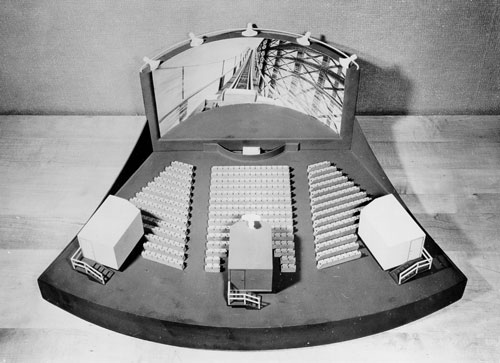
A competing technology, Cinerama, used an even more-ambitious trick: it displayed the film through three different projectors, each aiming at different parts of an extremely curved screen. (You can see a model of the technique above.) The result was bold, and though the technique itself isn’t used today, some of the theaters it inspired are considered legendary.
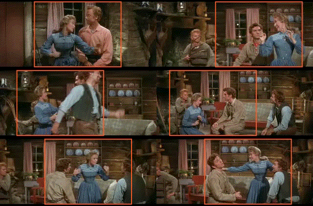
All these tricks were great, of course, for film-goers, but when the movie inevitably was put on a TV screen, it often meant a game of compromises. Many television networks decided to tackle the issue by using “pan-and-scan” versions of the films, which basically involved a film engineer selectively focusing on small parts of the screen and shifting the layout so as to match what was happening on the screen. This GIF explains the technique well:

This technique, as you imagine, has some really negative effects on the films that used it. If a film was framed so that two people were standing far apart, for example, one would inevitably be cut off. Panning-and-scanning could hide moments of tension or even remove key characters from a scene.
It ensured that movie theaters had the better product, sure, but the popularity of home video ultimately made the issue untenable.

Directors friggin’ hate pan-and-scan, just an FYI
Beyond being controversial with serious film buffs, it’s far more so for the directors, who often were forced to make compromises just to take advantage of home video’s reach.
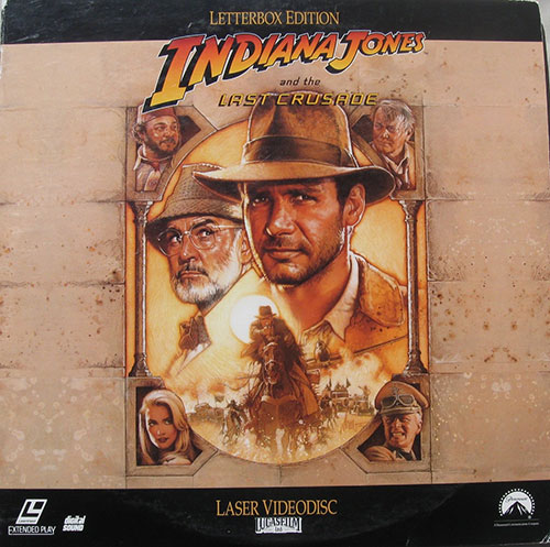
A 1990 piece by Roger Ebert, featuring an angry Steven Spielberg insisting that people will buy a widescreen version of Indiana Jones and the Last Crusade, nails the point—and then some.
“The only time I lose my integrity as a filmmaker, is when my films go on TV. I lose it because I’m very frame-conscious, very conscious of my visual compositions, and I do a lot of things to tell a story by where I put characters and objects within the frame,” the directing legend told the reviewing legend.
These compromises, Spielberg continued, damaged his artistic vision.
“You can either pan and scan, which means you electronically pan the frame, or you make internal cuts in a scene, from one side to the other,” he explained. “The problem with cutting is that you’re adding cuts where a cut is not required—where you don’t want a cut. When I see my movies panned and scanned, it’s like some of the scenes were being redirected by someone else.”
Letterboxing was the solution to this problem—and the approach that Spielberg greatly preferred—but for decades, it was a hard sell with consumers, who believed they were missing something.
In 2001, Martin Scorsese went as far as to launch an educational campaign with Philips to talk about how awesome letterboxing was.
“A director works painstakingly to set up a shot or scene—the whole meaning of which is lost when a film is cropped or panned and scanned to fit a standard television screen,” he said.
In case you need any more proof, Scorsese talks up the issue in this Turner Classic Movies bit, which features his greatest widescreen pet peeve, a chariot scene in Ben Hur. (Ironically, the segment was filmed in standard 4:3.)
21:9
The aspect ratio of so-called CinemaWide TVs, a trend in home entertainment that’s gone in and out over the years. The idea behind these TVs is that the aspect ratio roughly matches wide-screen films, so there’d be no letterboxing whatsoever. The results of this strategy have been mixed; Philips went in on the platform for a bit, only to double back after consumers weren’t interested. And CNET‘s review of a Vizio CinemaWide television found an unusual problem with the monitor. “Anything that’s not an ultra-wide-screen movie—like the vast majority of HDTV programs, games and, yes, many films—appears tiny, with big black bars to either side, or else must be cropped or stretched to fill the screen,” they wrote. A recent effort by Samsung, however, gets around this by actually being two televisions that can join together to become either a 16:9 screen or a 21:9 screen.
Five notable moments in the history of letterboxing
- As we pointed out last year, RCA’s video-on-vinyl Selectavision VideoDisc was not a well-loved video format, but the Capacitance Electronic Disc that drove the format does have the honor of being the first to have a movie released for it that used letterboxing. That film, Federico Fellini’s Amarcord, came about in January of 1984. Other early films that used the technique include Monty Python & the Holy Grail and the Woody Allen film Manhattan.
- The Criterion Collection, launched in 1984, represented one of the first concerted efforts to release films in a home-video format that perfectly matched the original layout of the films upon their release. The strategy, started with its Laserdisc release of the 1956 film Invasion of the Body Snatchers, which was filmed in SuperScope, was intended to keep the filmmakers’ original vision intact. “We endeavor to present every film in its original aspect ratio (i.e., the ratio of height to width of the image), unless the filmmaker expressly requests a slightly different framing,” the company says in its FAQ. Criterion, uniquely, also releases early 4:3 films with a small letterbox around all sides, so as to avoid oversetting by televisions.
- One of the first big mainstream films that was released in a letterboxed home video format was Ghostbusters 2, which first hit stores on VHS and Laserdisc formats in 1990. At first, customers were confused—why was a third of the picture gone?—and that led to complaints, which eventually went up the food chain. As it turned out, those consumers had a point, because the person who did the letterboxing decided it would be a great idea to format the screen narrowly, but still do up the film in a 1.66:1 pan-and-scan format. So it was basically the worst of all worlds.
- In 2003, the video chain Blockbuster, which was still influential at the time, formally decided to favor widescreen films in stocking DVD rentals, a move that effectively proved that widescreen films had gone mainstream. A 2004 Slate piece argued that this proved that widescreen had become a bonafide phenomenon. “There’s a bigger factor behind widescreen’s triumph: what you might call the continuing education of the filmgoer. If casual movie fans prefer pan-and-scan and film buffs prefer widescreen, then one way to tip the balance is to turn the casual fans into buffs,” Bryan Curtis wrote in the piece. “The DVD format seems to have had precisely that effect.”
- Letterboxing is sometimes used for artistic reasons, so as to better highlight certain aspects of the film. Wes Anderson’s The Grand Budapest Hotel, which covers three different eras, quietly uses aspect ratios commonly associated with each era—1.37:1 for the 1930s, 2.35:1 for the 1960s, and 1.85:1 for 1985 to the present. In an interview with Filmmaker Magazine, Anderson said that he was able to get away with it essentially because we’re used to seeing letterboxes everywhere.
“We want to offer the best picture and provide the original aspect ratio of any title on Netflix. However, unfortunately our quality controls sometimes fail and we end up offering the wrong version of a title. When we discover this error, we replace that title as soon as possible.”
— Netflix spokesman Joris Evers, in a comment sent to The Huffington Post in the wake of the popular discovery of a Tumblr site called “What Netflix Does,” which revealed that the company was crudely cropping a number of films in very awkward ways. (The Tumblr site appears to be down at this juncture, unfortunately, replaced by a spam site, but the Internet Archive is your friend.) The situation, essentially, appears to be this: the company has been bringing films into its streaming library, but those films are often not of the same quality globally, and as a result, the films are sometimes cropped in unfortunate ways. That said, running into panned-and-scanned movies these days is no accident: University of Wisconsin Film Researcher David Bordwell, meanwhile, writes that cable channels are still doing it to this day, though updating the technique for the HDTV era. (In one notable case, The Graduate’s opening credits are shown in widescreen, only to switch to pan-and-scan a moment later.)
The fascinating thing about this piece is that when I mentioned this concept to people, many of them—including major film buffs—weren’t even aware what letterboxing was, or that it was at one point controversial.
That to me suggests a major shift in perception within just the last few years. I’d like to think that two things happened to encourage that shift: Laptops and smartphones.
Watching a video on these devices, particularly in full-screen, generally means that there will be some natural letterboxing going on, just simply due to the design of our machines. A YouTube embed commonly has a letterbox, even though we never really think of it like that.
As a culture, I think we’ve come to embrace that our videos don’t always go edge-to-edge, and find comfort in that. We weren’t buying Spielberg’s argument back in the day, but we made our peace.
That said, though, if you watched a Cinerama film in its natural letterbox style, you’d probably notice, because it’s weird as hell.
:format(jpeg)/2018/01/i9cxntilojibkyjs5lpk-1.gif)
/2018/01/i9cxntilojibkyjs5lpk-1.gif)

/uploads/ernie_crop.jpg)