Window Dressing
When macOS was still OS X, some Windows users weren't afraid to remake their desktops in Apple's vision. It was the ultimate case of imitation and flattery.
Today’s GIF comes from a YouTube guide on how to make your Windows 10 install look like macOS.
Sponsored By … You?
If you find weird or unusual topics like this super-fascinating, the best way to tell us is to give us a nod on Ko-Fi. It helps ensure that we can keep this machine moving, support outside writers, and bring on the tools to support our writing. (Also it’s heartening when someone chips in.)
We accept advertising, too! Check out this page to learn more.
1995
The year that the tech company Stardock came up with an interface modification program called “The Workplace Toolset/2,” which was designed for the IBM platform OS/2. The product was soon renamed “Object Desktop” and became one of the operating system’s most popular utilities. In a 1995 InfoWorld review, writer Nicholas Petreley stated that the software “adds all the style and functionality that IBM neglected to add to Warp.” Unfortunately, OS/2 did not last quite so long and the program was soon shunted to Windows.
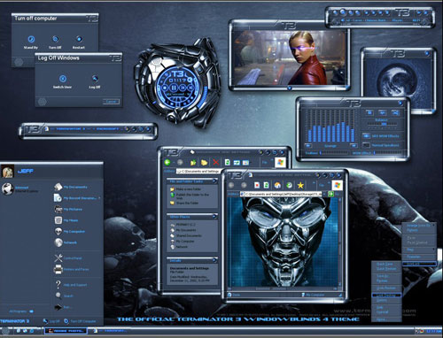
The customization app WindowBlinds was at one point such a big deal that the producers of Terminator 3 created a WindowBlinds theme to promote the movie. (via the Stardock website)
How Windows gained an under-the-radar legacy of alternative interfaces
Say what you will about Windows, but its interface was never the flashiest in town. (Windows 8 aside, of course.) Certainly, earlier versions of the software, like Windows 3.1 and Windows 95, did the trick, but by the end of the ’90s, the interface had grown a bit stale.
Even the Bush-era updates to Windows XP, with its iconic desktop image, weren’t enough for some folks who wanted something a little more out of their desktops.
One key splash of color to the drabness of Windows during this era was a piece of software called WinAmp, the Wesley Willis-inspired MP3 player that stood out because of its interface, which seemed designed to be not an app, but an ever-persistent piece of furniture. It was also highly skinnable, and part of the appeal of the player was putting a skin of your choice on the player—a great way for the 16-year-olds of the world to put their own personalities into the family computer.
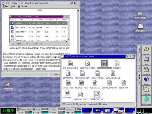
Object Desktop, as it appeared on OS/2. (via the Stardock website)
There was room for more of this kind of thinking in the Windows market, and the Michigan firm Stardock was in just the place to allow for that. The company, founded by Brad Wardell in 1993, had uprooted from its initial focus on OS/2 in the late ’90s, and slowly began to put its focus on Windows, despite having enough of a distaste for Microsoft that the company had made a game simulation called Entrepreneur that was directly inspired by the Redmond-based giant.
Fortunately for them, the basic ideas behind Object Desktop, which did more than simply skin the Windows interface, transferred over pretty easily. Windows users, it turned out, didn’t want their GUIs to be forced into a Microsoft-shaped hole—they wanted some control over the interface, too.
In a 2002 interview with OSNews, Wardell described the appeal of the software:
Each user uses their computer for very different reasons. Why should the person who mainly just surfs the web have the exact interface as someone who primarily enters in data into a database? That’s what we have now by default. Our goal at Stardock as we move forward is to provide this flexibility in terms of personalization and in letting users deal with information in a more organized and easy to understand way.
This desire for customization found its greatest success story in a product called WindowBlinds, which had the magic-seeming ability to change the frames around applications so that they were a little less boring. It effectively made every app a little more like WinAmp, allowing for a snazzy, skinnable approach. It was a only a small part of what Object Desktop could do, but it was the perfect level of customization for the average user, and as a result, it quickly became a hit among Windows users, and even earned a public seal of approval from Microsoft in 2001.
These tools, and others like them—it should be said, still available today—spoke to folks who wanted more customization capabilities than Windows was designed to offer on its own.
But they also allowed for something else: the ability for Apple’s design sensibility to elaborately infiltrate the machines being used by the 96.5 percent of computer owners who didn’t own a Mac in 2002.
And infiltrate they did.
“We call that new user interface Aqua, because it’s liquid. One of the design goals was, when you saw it, you wanted to lick it.”
— Steve Jobs, during a 2000 presentation at MacWorld SF, in which the then-iCEO introduced the interface for Mac OS X for the first time, called Aqua. The interface, as Jobs emphasized, was very experimental for its time, relying on a lot of visual splashes and glowing orbs. “Our goal in our user interface was two-fold: One, we wanted to give a much more powerful user interface to our pro customers,” Jobs added. “But two, at the very same time, we wanted to make this the dream user interface for somebody who’s never even touched a computer.”
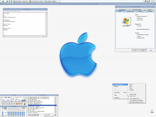
Mac osXP, an early Mac-styled theme dating to 2001. (via WinCustomize)
Why Mac OS X was the perfect target for interface customizers
In a world of beige boxes and square LCD screens, there was something aspirational about OS X when it first came out.
Certainly, there were a lot of things under the hood that made it a desirable system, even in its initial buggy version. And soon enough, the system’s rock-solid stability, a hand-me-down from NeXT, would make it a defining OS of the early 21st century, a mainstay of the WeWork crowd.
But something about the chrome-laden interface, one that Steve Jobs spoke of in terms of “fit and finish,” really put the system in a different place. Sure, there were other operating systems that held a certain kind of appeal during the era, but Mac OS X was different. It was a bit over-the-top, like the early iMacs in their Bondi Blue cases, and that boldness spoke to people.
It wasn’t everyone’s cup of tea, but enough teacups were being served that it was clear that it would eventually be one of the biggest selling points for the Mac. And eventually, thanks to the mainstream success of the iPod and the iPhone, plenty more teacups would be served after that.
Considering all that, OF COURSE a few Windows users wanted something that good on their own screens. Not everyone, but enough to make it a bizarre hobby for a time.
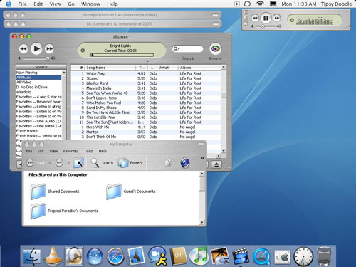
A Mac OS X mockup theme dating to 2004. Note the aggressive use of brushed metal. (via WinCustomize)
Five key elements of a Windows look directly inspired by OS X
- A dock, of course. Perhaps the most defining element of the entire mess, many have taken pains to create dock equivalents for Windows, including Stardock’s ObjectDock as well as its competitor, WinStep Nexus.
- A taskbar on the top. Of course, if you’re going to put a dock on the bottom, the Start Menu is likely to compete with the dock. And in earlier versions of Windows, the taskbar tended to be about the same size as the menu bar on Mac OS X, so reskinning it and putting the task bar up top was a great way of taking back Windows.
- Chrome that looks like a Mac. Who remembers that brushed metal look that iTunes and a bunch of other Mac apps used to have? Like everything else Apple has ever done, the look was controversial. While Apple eventually got rid of it, that’s the very type of design cue that Mac OS X skinning involves.
- The details. Recently, the Netflix show Arrested Development launched a website called Vote Bluth that was designed to look like it was designed in 1999. One way it nailed the look was by disabling font smoothing on the webpage. A proper Mac mockup needs touches like this as well, and in the case of the Mac, fonts simply render better on a Mac versus a PC do to differences in rendering engines, which means that you need a tool like MacType to fix things up so it looks like an honest-to-God Mac install.
- Lots of copyrighted materials. If you want to complete your look, you’re probably going to be pulling a lot of backgrounds and icons from another computer. Like using a Hackintosh, the copyright on these materials is probably murky at best. Taking icons intended for other reasons and reusing them opens up a lot of legal pitfalls.
2005
The year Yahoo, the former internet giant owned by Verizon these days, purchased Konfabulator, soon renaming it to Yahoo Widgets. The software, a popular widget-based customization tool, originally showed up on the Mac, but gained momentum as a PC-based tool after Apple released a similar technology in OS X Tiger called Dashboard. The similar technologies caused controversy.
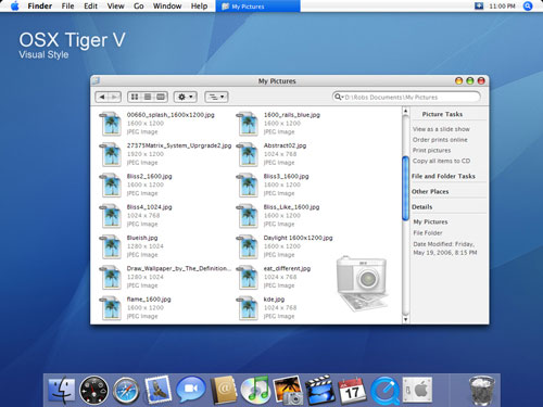
Mac OSX Tiger V, a Windows-based visual style based on OS X 10.4 Tiger. Note the taskbar up top. (via DeviantArt)
Apple initially took the cease-and-desist route to blocking PC skins
Apple, being Apple, didn’t feel all that great about this reskinning action, as it took something important to the company—its visual identity—and put it in unsteady hands.
And initially, that meant lawyers were involved. In February of 2001, roughly a month before the first public release of OS X 10.0, Apple had its legal dogs go after Stardock, calling on the company to remove any screenshots of interfaces that looked anything like OSX. Brad Wardell complied, according to MacWorld, but found the situation untenable, due to the inevitable inspiration that users were to take from the buzzed-about operating system:
That’s where things get really murky. What if we posted something that was inspired by Aqua, they objected and we remove it. If we do that for Apple, how do we know every single person that uploads something wasn’t inspired by someone else’s work? That creates an impossible situation for us to moderate ... Again, I am discussing this issue with Apple and my legal counsel.
The company would even go after design enthusiasts on its own turf. In 2001, the company publicly went after an open-source endeavor called the Mac Themes Project, which simply allowed users to design themes for Mac OS 8.5. Unlike the Windows themes, the project simply wanted to make it easy to design new themes for Mac OS, but Apple claimed that simply allowing users to modify its themes violated its copyright. (The cease-and-desist threat didn’t work, however: The project, long forgotten about, is still up to this day.)
macOS SkinPacks.
In the end, though, Apple’s attempts to try to nip the user-modification issue were unsuccessful, and worse, contrasted sharply with how Microsoft was handling the situation. And over the years, hundreds, if not thousands of theme modifications have shown up online, including on WinCustomize, a site owned by Stardock; on standalone sites like SkinPacks; and on artist hubs like DeviantArt.
In the end, these movements were driven not by trying to pull a fast one on Apple, but by an attempt at reverence. And considering the complexity of the strategy (try uninstalling a Mac skin and see if you get your original Windows machine back), it wasn’t like a ton of people were doing it anyway.
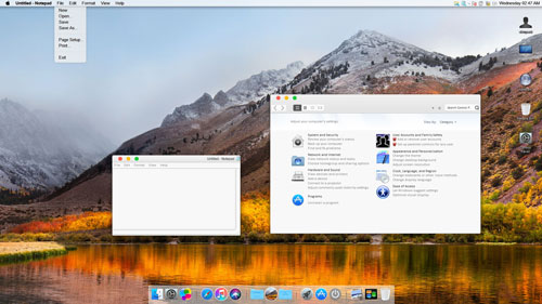
Of course, while you can still find relatively up-to-date examples of Windows 10 skins, things have slowed down a bit. While I’m sure there are probably some Windows 10 users out there trying to modify their interface to look like High Sierra as we speak, ultimately, the endeavor has become less useful as our machines have evolved.
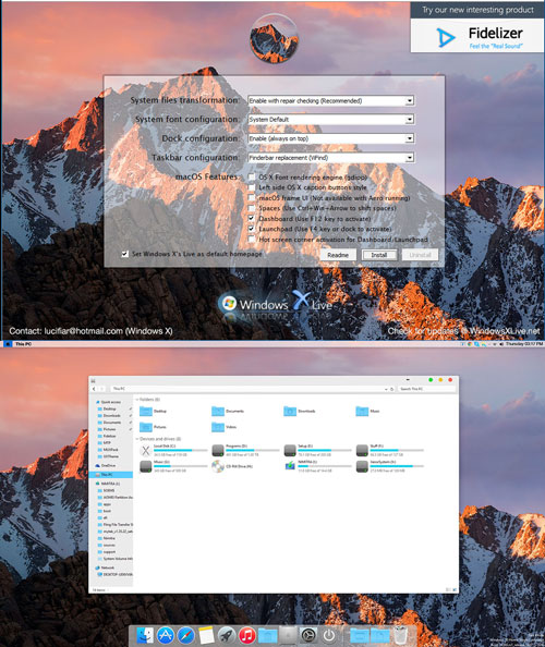
The macOS Transformation Pack.
Case in point: The macOS Transformation Pack, perhaps the most elaborate of the Mac remakes (and one that relies on a large amount of imagery copyrighted by Apple), hasn’t been updated in nearly two years—bad news when the operating system you’re trying to mimic updates every year.
“With declining trends of OS customization, we have [fewer] talented artists in community,” Windows X Live, the hosts of the transformation pack, wrote in 2016. “Windows and macOS has less news and UI enhancements to update.”
Long story short: Why modify Windows 10 when you can turn your machine into a Hackintosh that actually runs macOS, a space Apple seems to be ignoring anyway?
If you’re looking for a place where Mac reskinning is still kind of an exciting phenomenon, you might want to look in the general direction of the PowerPC chip—the architecture Apple left behind.
A solid eBay trade still exists around Apple machines that use the chips, despite the fact that they’re running on hardware that predates the iPhone and possibly even the iPod. On the other hand, as we’re nearly a solid decade on from Apple dropping native support for PowerPC processors on its operating system, these Mac superfans are motivated to rewrite Apple’s history slightly, to imagine what would happen if OS X stayed on PowerPC, instead of going to Intel long ago.
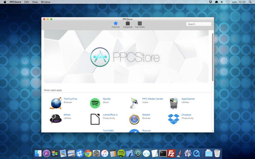
In early 2017, a MacRumors user named SourceSunTom released a new skin for OS X 10.5 that effectively brought many of the design sensibilities of the most recent versions of macOS—particularly Sierra and High Sierra—to machines that are more likely to show up at an Apple museum than on someone’s desk in the modern day.
It’s one of a number of similar efforts, but SourceSunTom’s approach is one of the more ambitious out there. Since first launching Leopard Rebirth, he’s created a service called the PPCStore, which works similarly to the Mac App Store as a way of keeping old-but-working PowerPC apps in circulation, and has teased a PowerPC variation on Siri in YouTube videos.
In a way, it’s aspirational.
:format(jpeg)/2018/05/tedium052218.gif)
/2018/05/tedium052218.gif)


/uploads/ernie_crop.jpg)